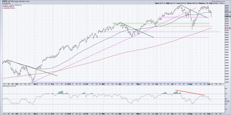
Chart Your Path to Understanding Market Tops
Chart analysis is the bedrock of technical analysis, providing valuable insights into market behavior and potential turning points. In the realm of market tops, three key charts can provide a roadmap to investors and traders to navigate these crucial periods with more confidence and awareness.
The first chart to scrutinize during a potential market top is the price chart itself. Pay close attention to the long-term trend line and any significant support and resistance levels. A break below key support levels could signal a reversal in the prevailing trend, while a failure to surpass resistance may indicate a lack of bullish momentum.
Additionally, moving averages can offer valuable confirmation signals at market tops. The death cross, where the shorter-term moving average crosses below the longer-term moving average, is a classic bearish indicator. Conversely, a golden cross, where the opposite occurs, can signal a bullish turnaround. These moving average crossovers can act as early warning signals of changing market sentiment.
Lastly, monitoring market breadth through indicators such as the advance-decline line can provide crucial insights into the health of the overall market. Divergences between the price and breadth indicators can be a red flag for a potential market top. If the breadth indicator fails to confirm new highs in the price index, it may indicate underlying weakness and a heightened risk of a market reversal.
In conclusion, employing these three key charts – price chart analysis, moving averages, and market breadth indicators – can help investors and traders identify and navigate potential market tops more effectively. By combining technical analysis tools with a disciplined approach to risk management, market participants can position themselves to capitalize on market opportunities while safeguarding against potential downturns.

